Art and the Hurdles of Printing it to Paper
Posted by Daniel Johnson on Mar 9th 2025
Introduction
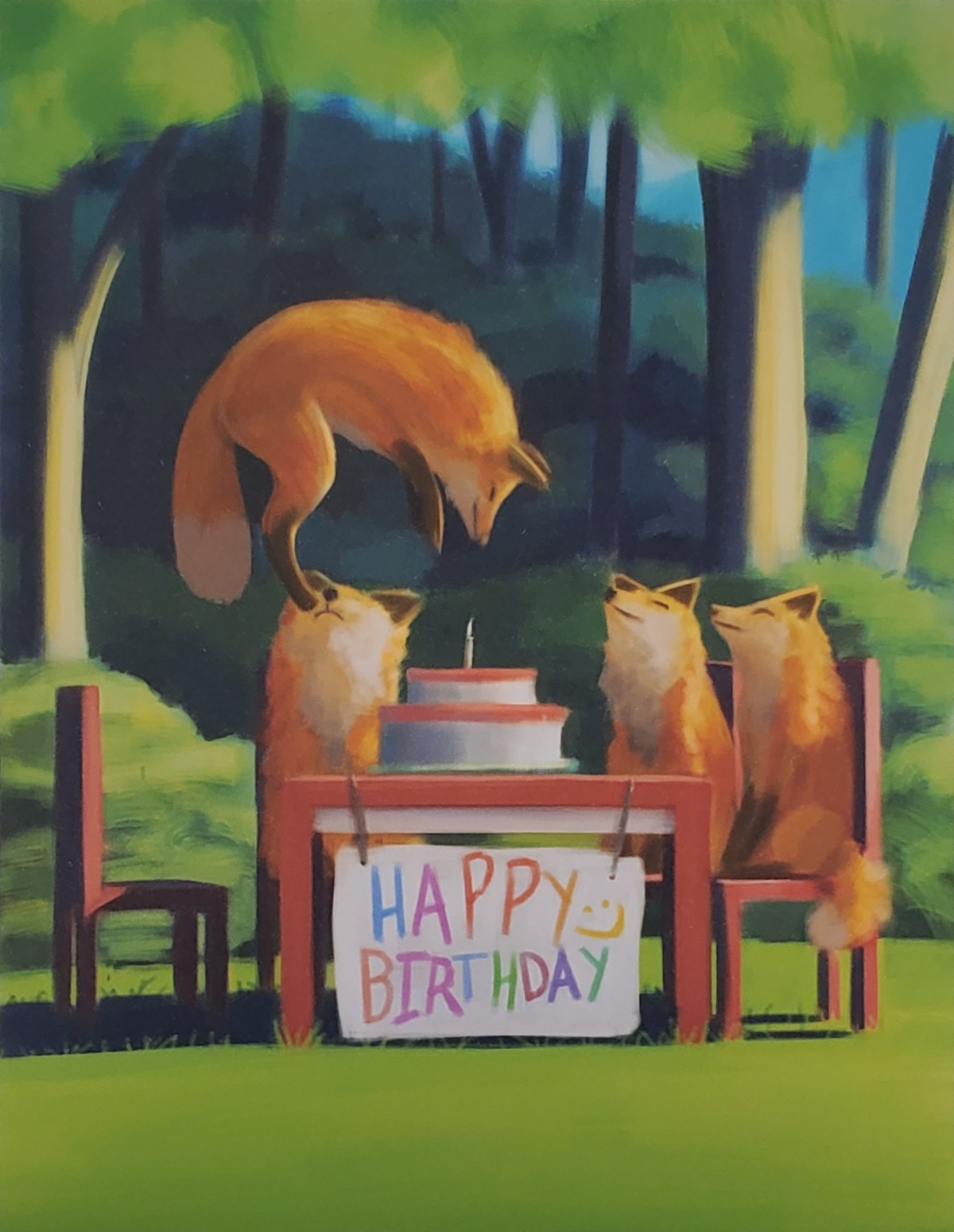
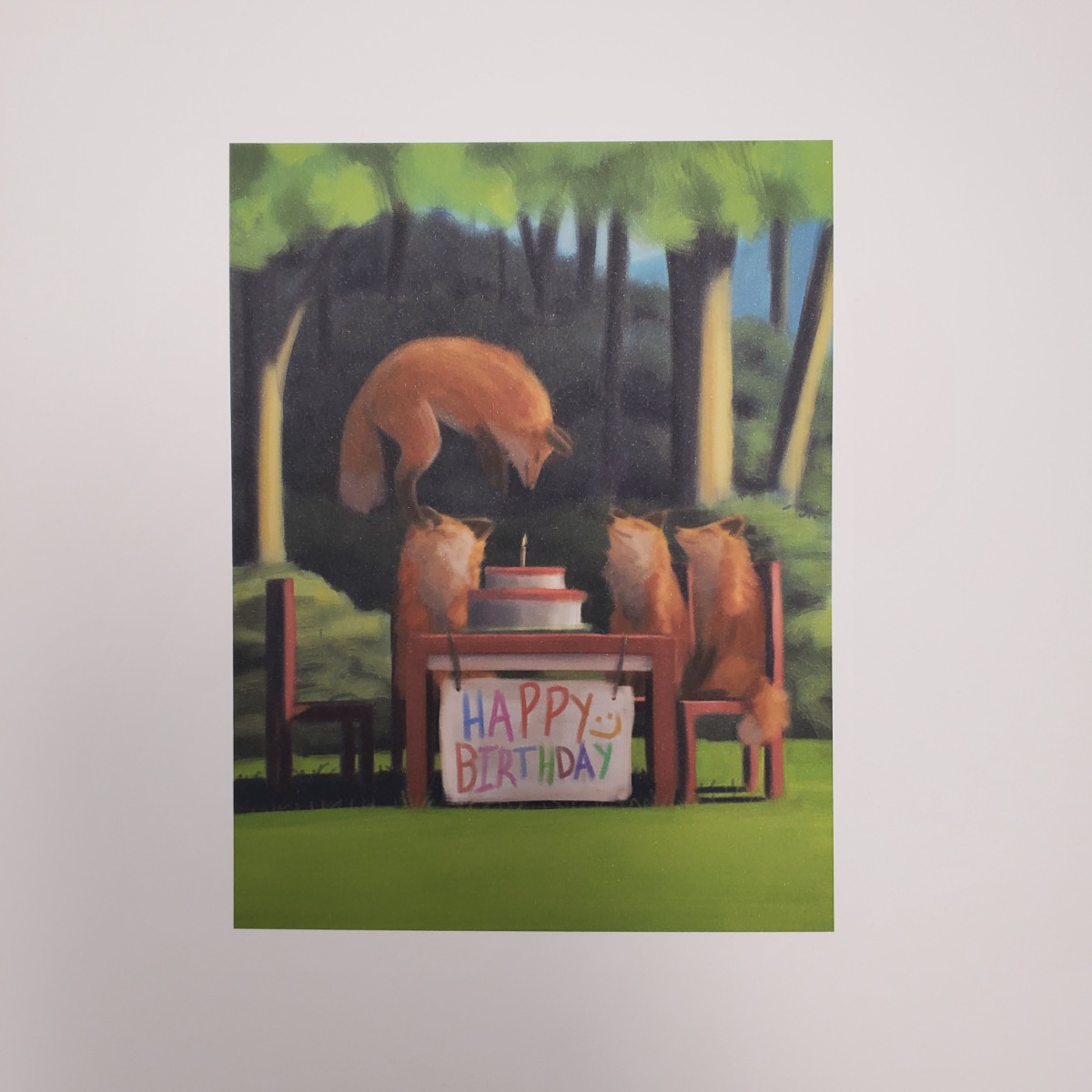
Printing art made with tools like photoshop to paper can be a surprisingly difficult task that will depend on the illustration and how you fine tune your printer. When working tools like photoshop or clip studio pro you need to appreciate the fact that the first few prints that you make will most likely result in a bad print. This can be from how the printer will perceive the digital media compared to how you may see it if you were to use a drawing tablet. With a drawing tablet you will likely have tuned the brightness and color settings to something you are most comfortable with. Unfortunately the printer you are using may not take those custom settings into account and will print an output that will be off from what you have originally envisioned. Using this lovely art made in photoshop we can see some of the issues that may arise. The printed version is too dark with the colors not as saturated as it should. More work will need to be done to get the printed art to match what was originally intended.
Fine Tuning the Printing
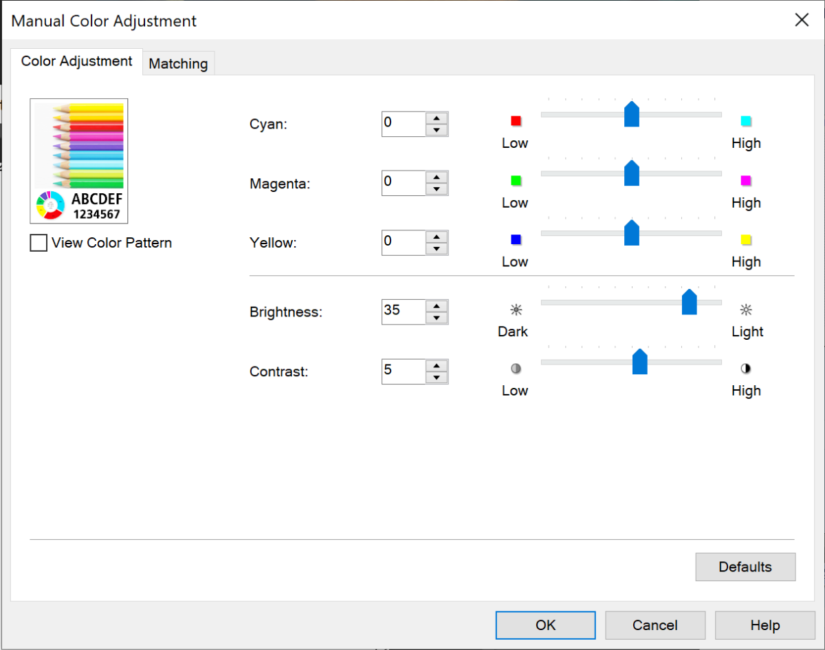
To fix this you may have to go into the print settings of the printer to adjust both the brightness and contrast. The image below shows the interface that I was using for the Canon PRO-200.
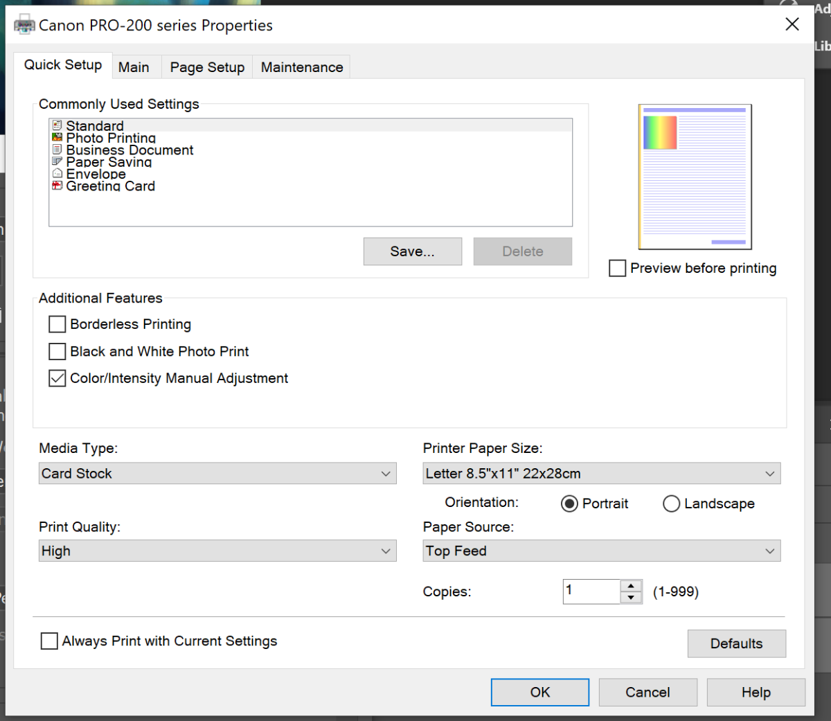
Switching over to the main tab we will need to make sure the print quality is set to high and the color/intensity is set to manual.
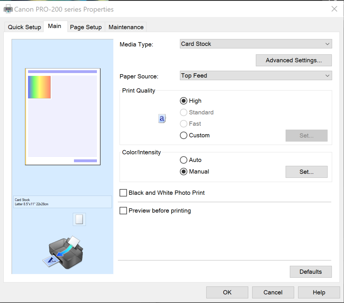
Then click on the set button to go into color/intensity settings to adjust the brightness and contrast.
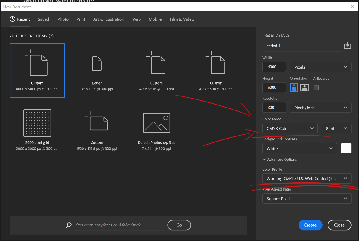
Another overlooked important piece of information you will need to know is to be sure to set the color mode to "CMYK Color" and resolution to 300ppi. Whatever printer you are using make new illustrations will rely on this setting to know how to print correctly. An example can be seen below.
Be ready to do some trial and error as you fine tune your color intensity and saturation settings. There is no setting that will perfectly match what was created in tools like photoshop, you can only fine tune the settings to be close as possible. With the adjustments made to brightness and contrast, significant progress has been made toward getting the image closer to what envisioned. Once you are satisfied with the settings for the printer, you can move onto the other half of this process that includes fine tuning the image itself.
Fine tuning the Art
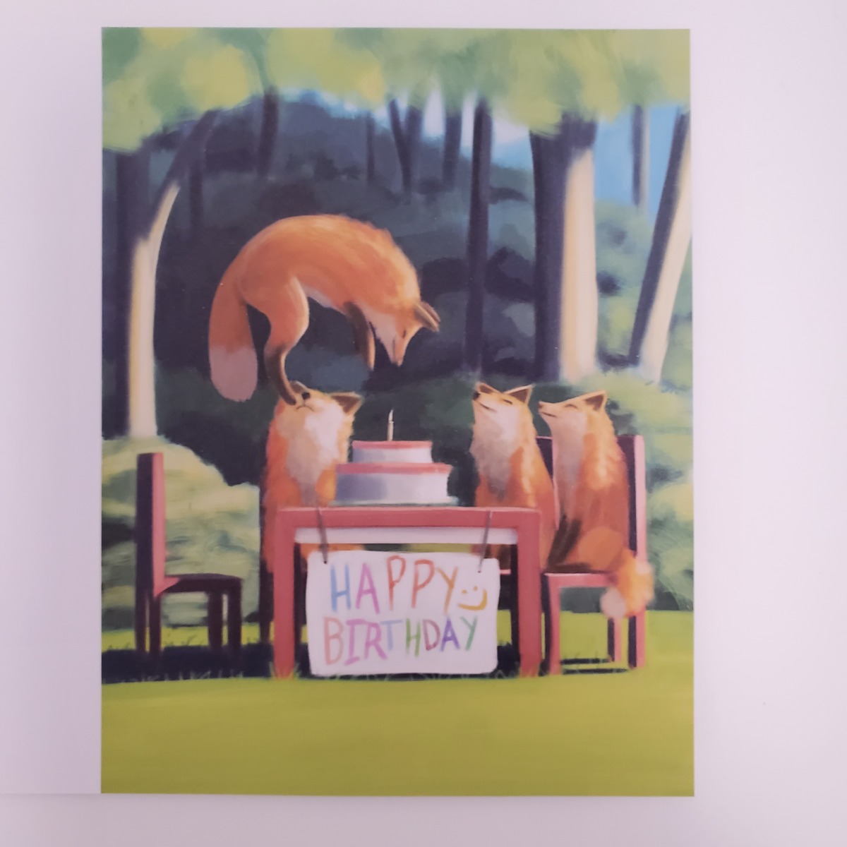
This is the part that where most of the work will occur when trying to get an illustration ready. Printing an illustration has the unintended consequence of exposing the rough edges of you art. Shape design and control in values become a very crucial component to getting it ready for printing. There may be happy accidents within the art that adds to the illustration, but when it being translated to paper the printer may not know what to do with it, so it becomes polluted with unwanted artifacts. You will have to refine and make changes to the illustration to clean the artifacts out. It can be a very drawn-out process where you are going back and forth with the printing, but if you can push through you can end up with something like this below.
Conclusion
When doing this for the first time, I have found persistence to be the key and an abundance of cardstock paper as you go through the process.
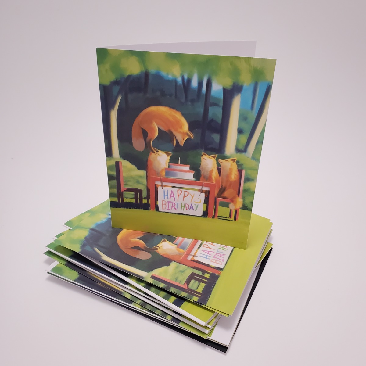
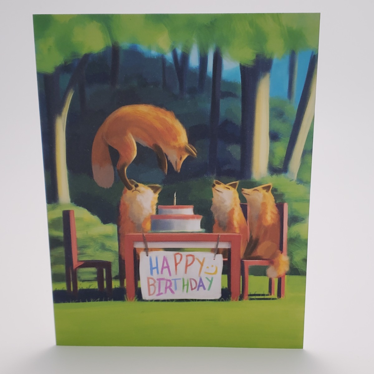
You will go through quite a few iterations before you get it right. But once you get it right the first time, it is easier to identify different queues in your art that will help or hamper the process. Things become more efficient and you can make more things like this.
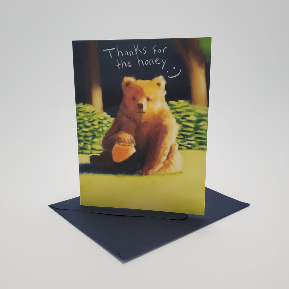
Or this
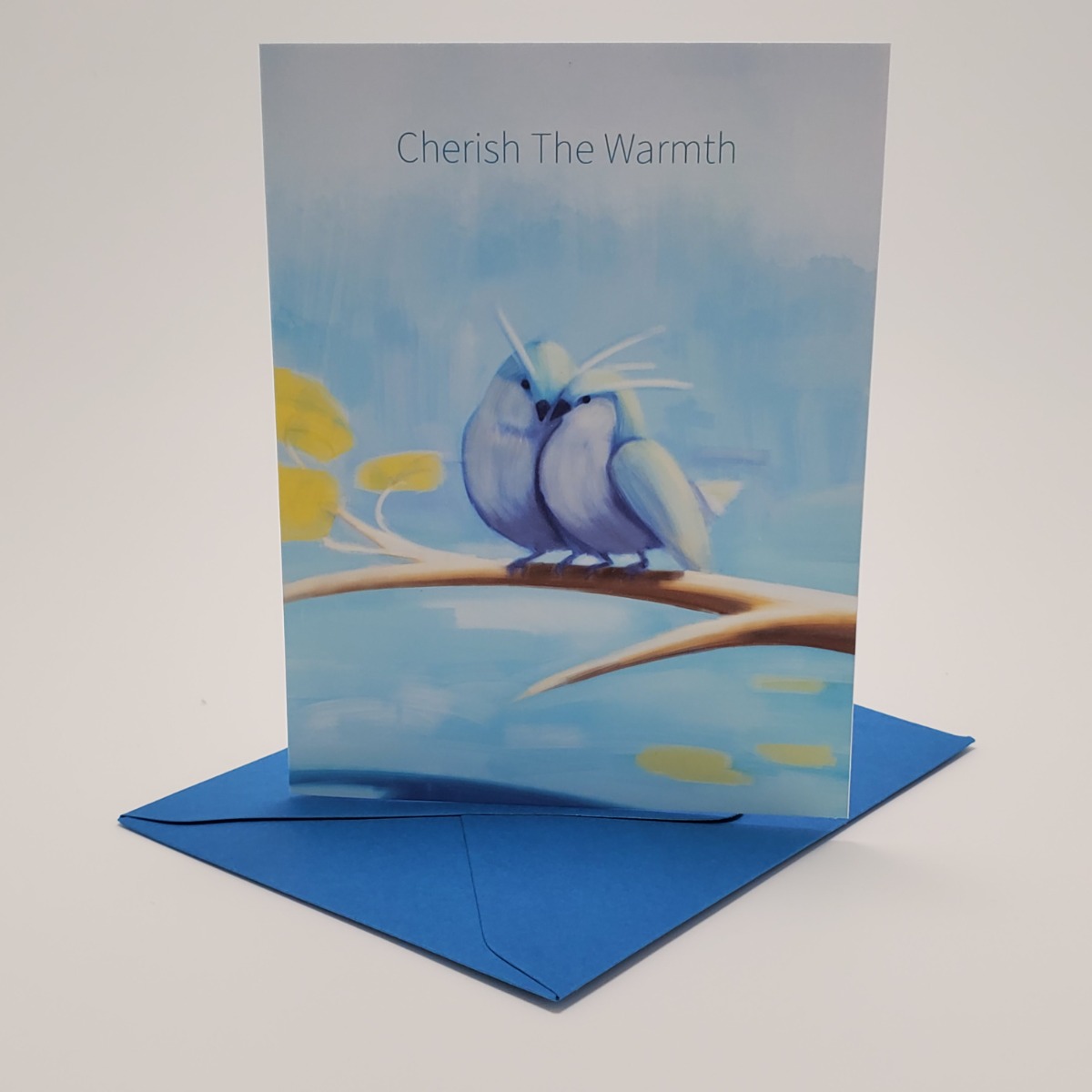
Interested in artwork on the greeting cards shown? You can find more here.